BMW changes logo for the digital age
News / Auto Makers
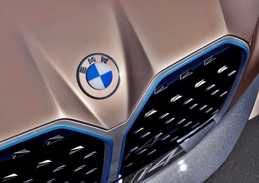
The biggest change is that the thick outer ring in the circular logo went from a solid black to transparent. So whatever color the logo is set against will appear in that portion.
The design was also made simpler and flatter, a change from the slightly rounded look of the old logo, which made it look more three-dimensional.
“With visual restraint and graphic flexibility, we are equipping ourselves for the vast variety of touch points in communication at which BMW will be present, online and offline, in the future.”
The new logo keeps the checkered blue-and-white pattern at its center. Blue and white are the colors of the brand’s home state of Bavaria in Germany. For years people interpreted the logo as a spinning propellor because that is how it was portrayed in a 1929 ad, the BMW website points out. But that interpretation is a myth, according to the site.
The logo’s biggest change is the transparency of the thick outer ring which means it takes the color of the background.
Design
Design experts are picking apart every little detail of the new look, as is often the case when brands change their logos.
Armit Vit, editor of a site called Brand New, which reviews corporate redesigns, is not a fan. In a post, he bemoaned the loss of the black background, “which I feel is what made the BMW so iconic and elegant, adding a rich contrast to the white and blue. Without the black and the concept of transparency for the new logo, it literally looks like something is missing.”
The Verge liked the “flatter design that ditches the very dated 3D effects.” But the site, which covers technology, science, art, and culture, disliked the transparent effect, saying it looks “like someone on the creative team got sloppy and accidentally deleted the background on the Photoshop file before they exported it.”